Challenge
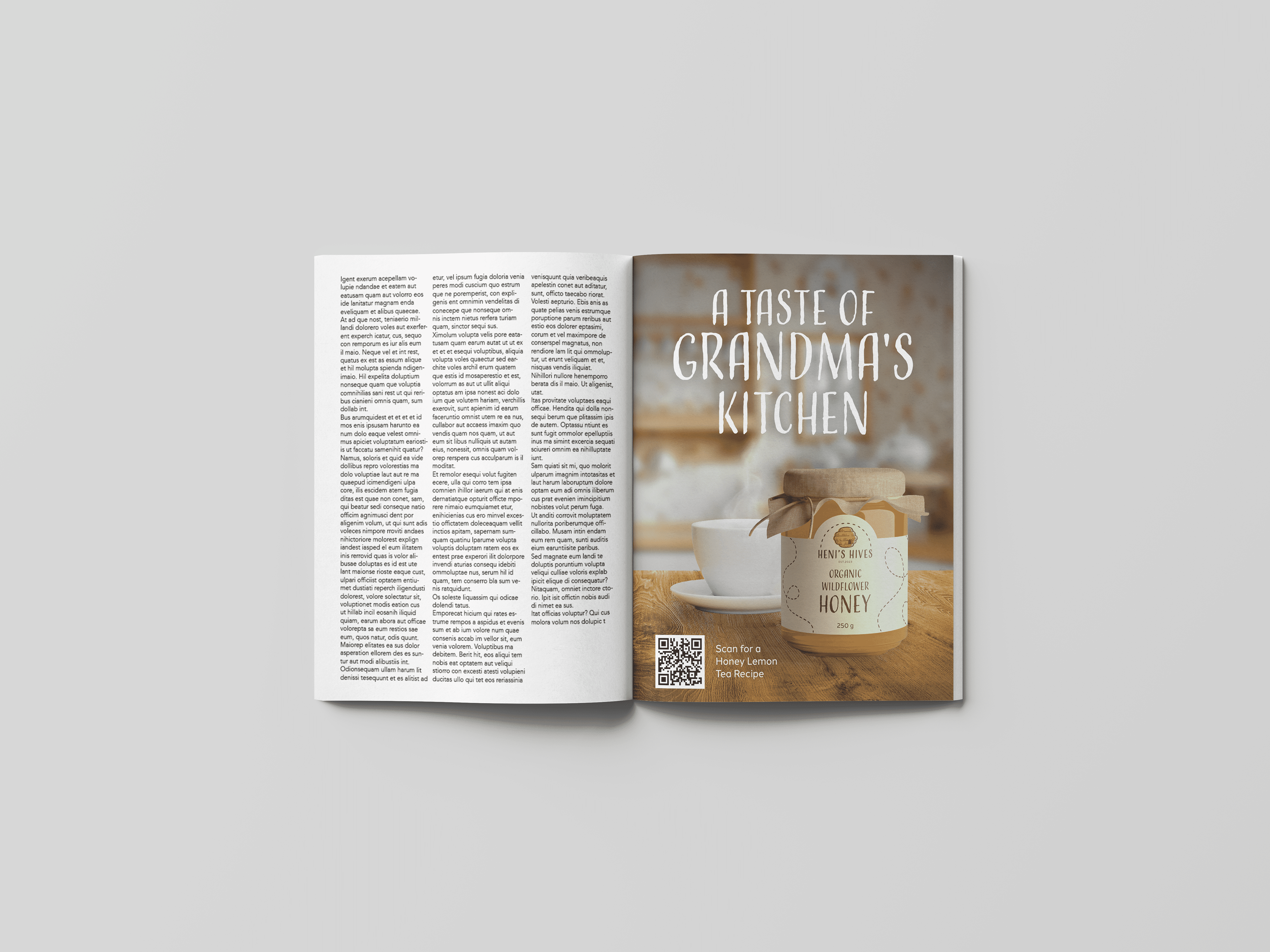
Heni's Hives is a fictional honey company that was looking for a branding system and assets to launch the business. The goal was to develop a warm and welcoming brand while paying homage to the founder's grandmother, who serves as inspiration for the company.
Solution
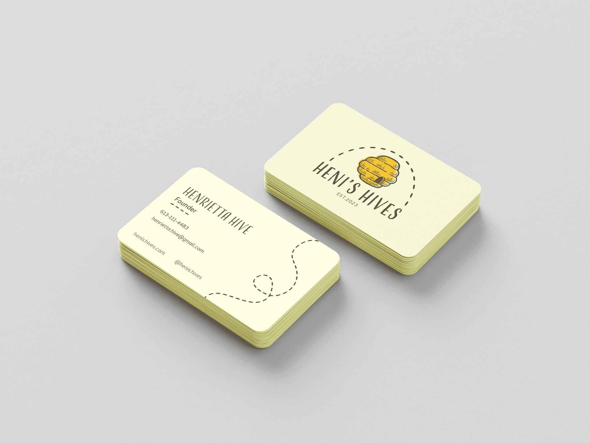
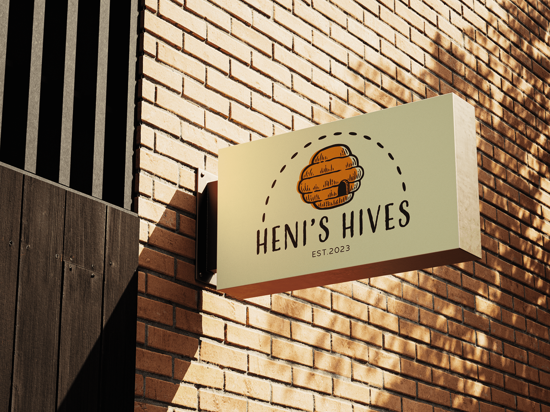
Typography and imagery were chosen and created to look more natural. A purposefully unrefined direction was taken to make the brand feel more authentic while maintaining professionalism. The rounded beehive imagery and overall semi-circle shape of the design were also used to help the brand convey a sense of friendliness.
